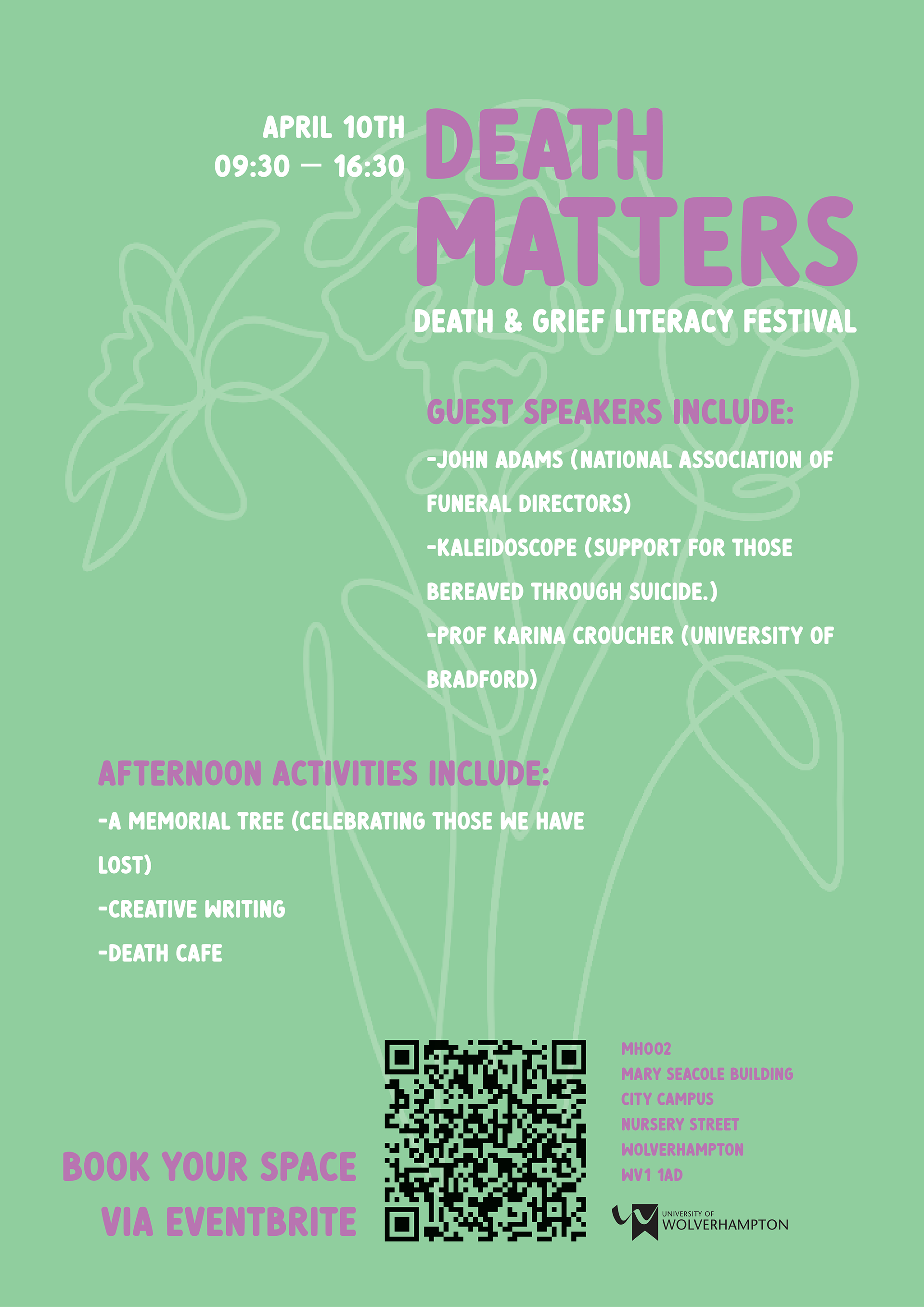
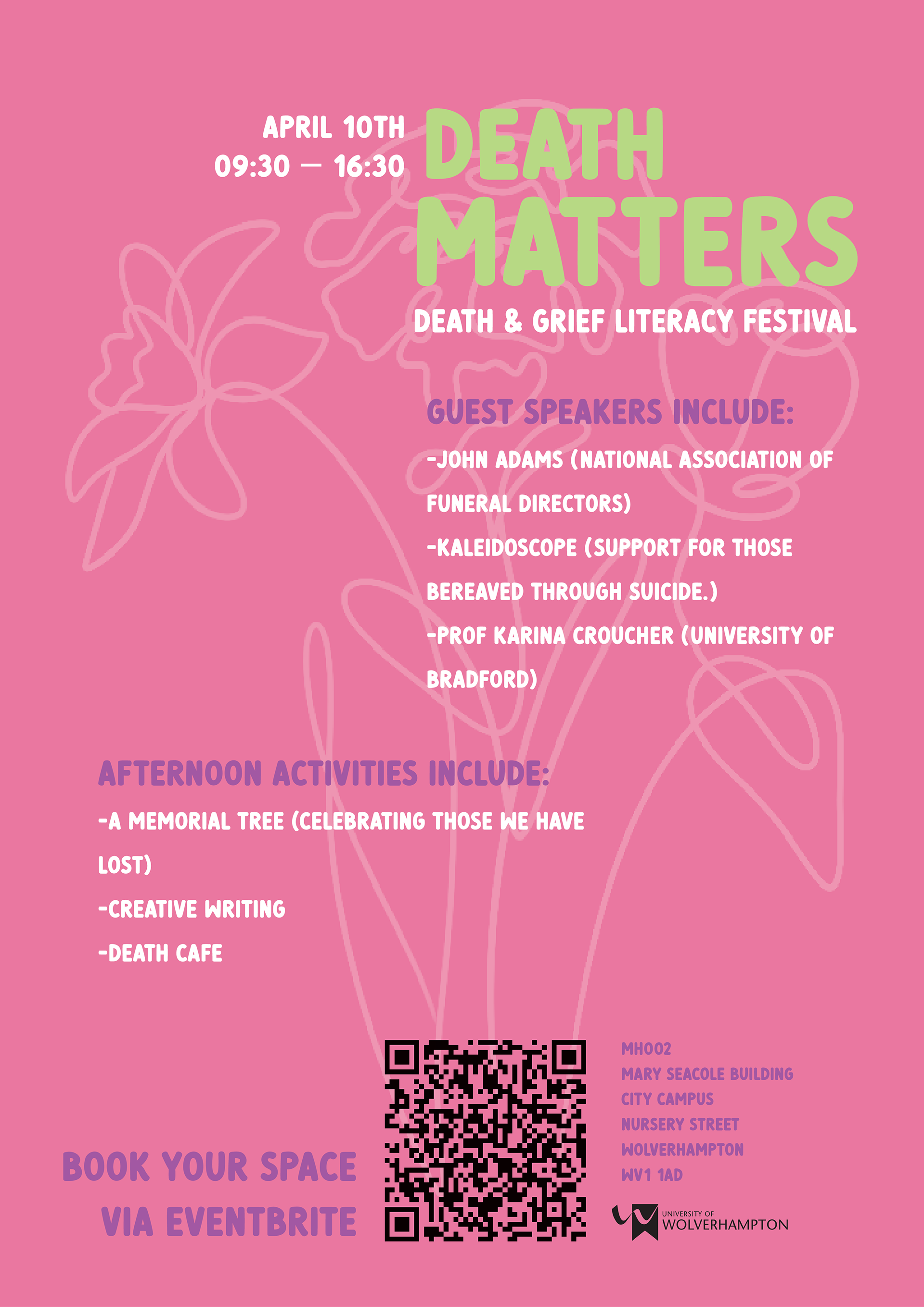
ENG: This assignment was to make a poster for ‘Death Matters’, which is an event aimed at enhancing grief and death literacy within the University. Part of the challenge for this poster was ensuring it didn't have a dark, death-themed vibe but instead conveyed a positive tone. For my poster, I chose a typeface that's clear but also not too strict, for colour palette, I wanted something bright and cheerful, but also soft on the eyes. I struggled with finding the right imagery, so I decided to go with hand-drawn flowers, each has a meaning that relates to grief. I lowered the opacity as I didn't want the image to be too overpowering. Definitely a challenging task, but it made me consider different perspectives and approaches to certain topics when designing.
CRO: Zadatak je bio izraditi poster za ‘Death Matters’, događaj čiji je cilj poboljšati razumijevanje tuge i smrti unutar Sveučilišta. Dio izazova kod ovog postera bio je osigurati da ne djeluje mračno ili previše povezan s temom smrti, već da prenosi pozitivan ton. Za svoj poster odabrala sam tipografiju koja je jasna, ali ne preozbiljna, a za paletu boja htjela sam nešto svijetlo i vedro, ali ugodno za oči. Imala sam poteškoća s pronalaskom odgovarajuće slike, pa sam se odlučila za ručno crtano cvijeće – svaki cvijet ima simbolično značenje povezano s tugom. Smanjila sam im prozirnost jer nisam htjela da slika bude prenapadna. Definitivno zahtjevan zadatak, ali me potaknuo da razmišljam iz različitih perspektiva i da pristupim određenim temama na nove načine u dizajnu.